Descriptives
Posted on Thu 24 July 2014 in R-course

Say you were standing with one foot in the oven and one foot in an ice bucket. According to the percentage people, you should be perfectly comfortable. 1 ~Bobby Bragan, 1963
Encountering data
Here we will describe the techniques you should use to give yourself and your readers/bosses/teachers a good feel of the data. This is often called descriptive statistics. In this context a statistic is a single number that summarizes your data. It is important to know what type of data you have and the level of measurement but we will put off that discussion for a a few paragraphs. I am also putting off a discussion of why statistics is important and I am just assuming that this is something you have to do in order to do your research.
Here is the daunting part, your data is usually a long list of numbers. How do you describe that? Usually the first technique you want to use is to graph all of the numbers together. In fact all of the data has a special name.
Your data is called the sample distribution. How do we get that data into R? Again, we will defer that question. One nice feature of R is that it has some data built in. For example, it has the average amount of precipitation for 70 cities in the United States. We can use this data to illustrate a few techniqeus that you can use on your own data.
str(precip)
precip[1:4]

Named num [1:70] 67 54.7 7 48.5 14 17.2 20.7 13 43.4 40.2 ...
- attr(*, "names")= chr [1:70] "Mobile" "Juneau" "Phoenix" "Little Rock" ...
    Mobile      Juneau     Phoenix Little Rock
      67.0        54.7         7.0        48.5
The str command gets the structure of the data. There are a few commands
for this summary is the other one I sometimes use. And precip[1:4] gave
us the first four elements. Here are some other built in datasets
str(rivers)
str(discoveries)

num [1:141] 735 320 325 392 524 ...
Time-Series [1:100] from 1860 to 1959: 5 3 0 2 0 3 2 3 6 1 ...
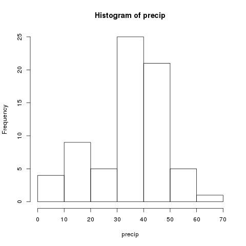
The first thing we want to get a sense of is how the numbers are
distributed. The best way to this is to use a histogram. A
histogram is a bar chart where we bin the count the number of
observations that fall in a defined range. I allows us to quickly
notice important properties. R has a function for computing this
built in.
hist(precip)
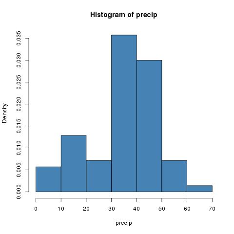
We can imporove this by passing two parameters. The first is designating
a color (col) and the second is not computing the frequency counts but
instead dividing by the total observations in our sample.
hist(precip,col="steel blue",freq=FALSE)
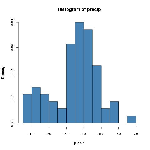
Two important and frustrating things to note about histograms. They
are highly dependant on the number of bins we choose. We will show an
example below of manually setting the bins. Second there is no
general algorithm for setting the number of bins. We can only repeat
it for an increasing number of bins and stop when the shape is stable.
Now we are also supressing the printing of a title. For more
parameters of hist type ?hist at the console prompt. Histograms
were first introduced by Karl Pearson.
hist(precip,breaks=10,col="steel blue",freq=FALSE)
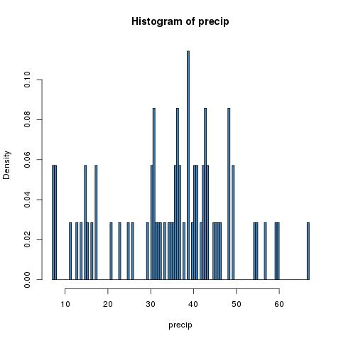
hist(precip,breaks=200,col="steel blue",freq=FALSE)
The ugly history of statistics
Karl Pearson was a British mathematician. He is considered the founder of mathematical statistics. Dr. Pearson established the first department of statistics in the world at University College, in London. However, he was also the founding editor of the Annals of Eugenics. Dr. Pearson advocated for the restriction of immigration by Jewish people to Britain on the basis that ``this alien Jewish population is somewhat inferior physically and mentally to the native population.'' 2 He also thought that war between the races was inevitable.
A number of prominent founders of statistics and biostatistics shared Dr. Pearson's views. I find that these embarassing facts are often left out fo the history of statistics. I think it is important to remember these ugly warts so that we can separate these important contributions from the ugly politics of their inventors allowing us to use our research to make rather than inhibit social progress.
Stem and leaf plots
Another older technique for exploring data is to draw a stem and leaf plot. These were popularized by John Tukey in his book Exploratory Data Analysis 3. The leading digits of the data are the stems while the final digits are the leaves. The graph is drawn left to right with a vertical line separating the stem and leaves.